Gradual Engagement
Goldfish have 9 second attention spans. Crazy right? Well don’t judge those goldfish just yet.
A Microsoft study found that on average, we generally lose concentration after eight seconds. Uh oh. Even more pressure on us as UX designers. That’s okay, we’ve got tools.
This post is a part of a series, “UX Design Patterns” and it aims to equip us with design patterns that can maximize our limited time with customers.
Context
Imagine you’re selling a product in person and you only have 8 seconds. How would you use your time? For starters, you wouldn’t lead by taking out a registration form and saying “please sign this before I tell you any more about this product”. Ideally, you’d have a tangible product that the customer can interact with. Why?
Because it’s more immersive. Forms are boring and a lot of the times, annoying. We should never lead with them and in fact, we should postpone them to as far in the user journey as possible. This allows us to lead in emotionally engaging ways. We can prove to customers why our product kicks ass.
This idea of “gradual engagement” is not novel but it’s important. Simply put, it’s a test-drive. We let users try our product before asking them to sign up.
Let’s see what it looks like in action.
Gradual Engagement Case Study: Calm
Calm encourages mindfulness meditation through guided sessions and activity tracking.
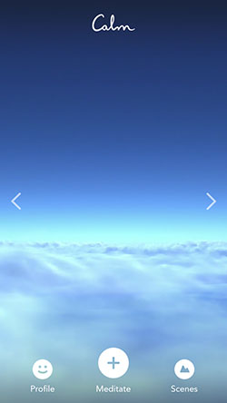
As soon as I open the app, I’m greeted with a beautiful full-screen video of a blue sky and moving clouds. Nice display of instant emotional impact.
![Calm’s home screen is a beautiful scenic video of moving clouds]](./husammachlovi-design-tactics-calm-home.jpg )
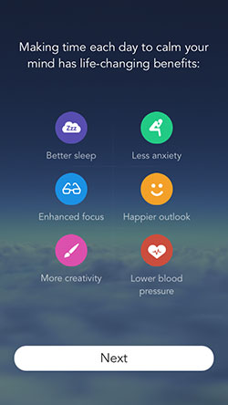
On the next screen, I learned some of the benefits of meditation. The simple iconography and minimal copy keep the learning light and fun. Great example of intellectual value driving emotional impact.
At this point, I was expecting to bump up into a registration form. Instead I was pleasantly surprised with options to start my meditation session, explore the rest of the app or enjoy the scenery.
I took a look around the rest of the app. Again, all this is accessible prior to registration. This is a great way to immerse users thereby buying more attention-time.
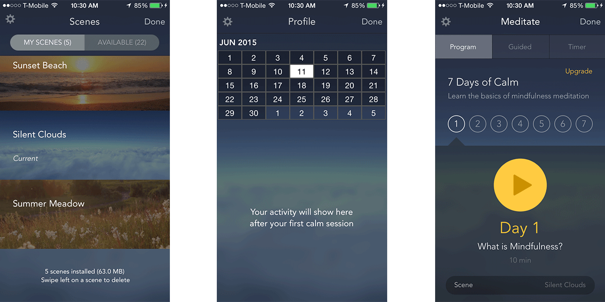
After browsing through the beautiful interface, I decided to give the meditation session a shot.
After I finished my 10-min session, I was taken to a registration view. And as I absolutely loved the session, I signed up with no hesitation.
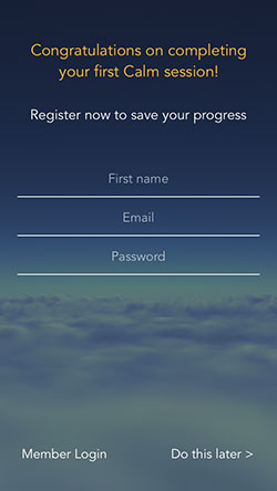
Calm is playing their cards right here. Chances are if users invest 10 minutes of their time in the on-boarding process, they will sign up. And by prioritizing the interesting over the boring (input fields), the chances that users will bounce early decreases.